

Logan Brooks
Crypto expert explaining blockchain technologies in a clear and accessible way.
How To Read Cryptocurrency Charts
Table of Contents
In the world of cryptocurrencies, every price movement matters — markets work 24/7, volatility is constant, and a single candle can shift the trend. If you want to invest or trade confidently, the ability to read crypto charts becomes essential.
Charts may look chaotic at first, but behind the lines and candlesticks lies a powerful tool. They reveal market psychology, highlight early trend shifts, and help you make decisions based on data rather than emotion. Now, let’s explore the main types of crypto charts and how to interpret them correctly.

Types of Crypto Charts
First, let's figure out what a cryptocurrency chart actually is. It is a visual representation of the price dynamics of an asset over a certain period of time. Crypto charts help traders and investors understand how prices change and make decisions about buying or selling based on the chart’s data.
With these tools, traders can quickly identify major trends, understand market sentiment, and evaluate how price movements may develop. Now let’s look at the main types of crypto charts and the unique insights each of them provides.
Line Charts
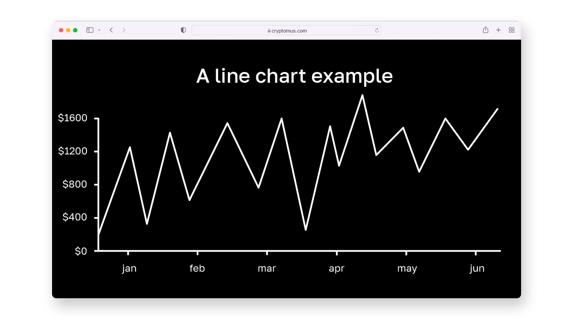
A line chart is one of the simplest, most popular, and straightforward chart types. It focuses solely on closing prices over a specified period, such as a day, week, or month. The closing prices are plotted on the chart as dots, which are then connected by a continuous line. This type of chart smooths out fluctuations and helps identify long-term trends without the distraction of minor price swings.
When to use: Ideal for beginners or for those who prefer a simple overview of an asset’s historical performance. Line charts are particularly useful when you want to quickly assess the overall direction of a market without getting bogged down in the details.
Example: If you’re analyzing Bitcoin’s performance over the past year, a line chart will clearly show whether the trend has been upward, downward, or flat, giving you a quick sense of where the market is headed.
Bar Charts
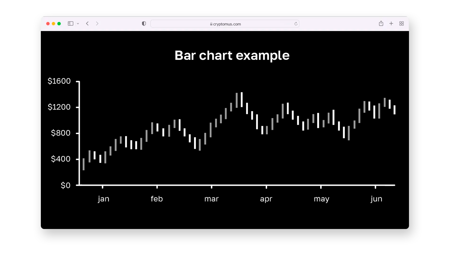
A bar chart provides a more detailed view by showing four key price points for each time period: opening price, closing price, high, and low. Each bar on the chart consists of a vertical line (representing the range from the lowest to the highest price) with short horizontal ticks on either side. The tick on the left indicates the opening price, while the tick on the right shows the closing one.
When to use: Beneficial for traders who want to dive deeper into price movements within specific time frames. Bar charts can reveal market volatility and help identify levels of support and resistance, which are critical for making buy or sell decisions.
Example: If you’re examining Ethereum’sdaily price fluctuations, the bar chart can show how the market reacted to significant news or events, allowing you to spot patterns like price consolidation or breakout levels.
Candlestick Charts
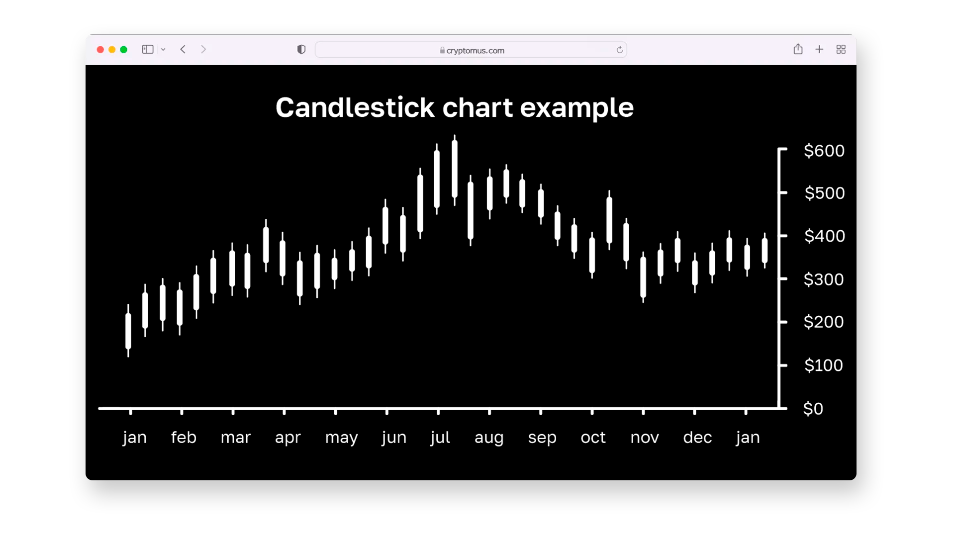
One of the most popular and widely used types of charts among experienced crypto traders, the candlestick chart displays the same information as the bar chart (open, close, high, and low prices) but presents it in a more visually intuitive way. Each "candle" consists of a body (the range between opening and closing prices) and wicks (the lines extending above and below the body, showing the highest and lowest prices). Green or white candles indicate a bullish (upward) movement, while red or black candles indicate a bearish (downward) trend.
When to use: Perfect for identifying short-term market sentiment and spotting trends or reversals. Traders often use candlestick patterns, such as "Doji," "Hammer," or "Engulfing," to predict market price dynamics and make informed decisions.
Example: Analyzing Bitcoin’s hourly candlestick chart during periods of high volatility can help you detect whether a trend reversal is imminent, based on patterns like a "Bullish Engulfing" candle.
Point & Figure (P&F) Charts
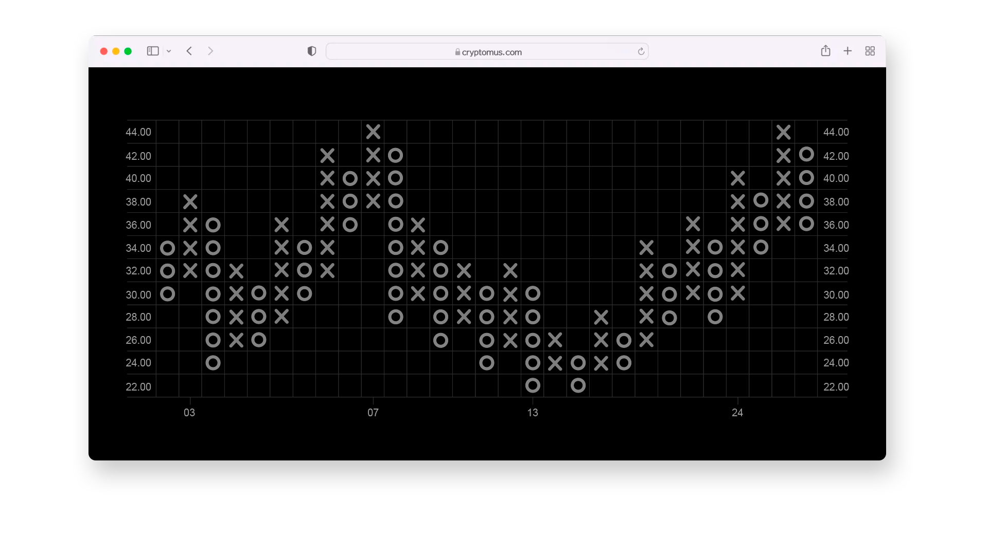
Unlike other chart types, a Point&Figure (P&F) chart focuses exclusively on significant price movements, filtering out minor fluctuations and completely ignoring time. This chart uses "X"s to denote upward movements and "O"s for downward ones. The result is a clear view of supply and demand, making it easier to spot breakouts and reversals.
When to use: Ideal for long-term analysis where the goal is to focus on substantial price changes and ignore market "noise." P&F charts are especially effective for identifying support and resistance levels and forecasting long-term trends.
Example: Using a Point&Figure chart to analyze the price history of a less volatile asset like Chainlink can help you identify when it’s approaching a significant resistance level, signaling a potential breakout.
Basic Elements Of Cryptocurrency Charts
To effectively analyze cryptocurrency charts, it’s essential to understand their core components. Each chart type, whether it's a line or candlestick chart, contains crucial elements that reveal valuable information about market conditions. Let’s break down the basic elements you'll encounter in these charts.
Timeframe
The timeframe indicates the period covered by each data point on the chart, which can range from minutes to hours, days, weeks, or even months. For instance, a 1-hour chart displays how prices change within an hour, while a daily chart shows the price movement for each day.
- Shorter timeframes(e.g., 5-minute, 15-minute, or hourly) are often used by day traders and scalpers to make quick trades.
- Longer timeframes (e.g., daily, weekly, or monthly) are more useful for swing traders and long-term investors who want to capture broader trends.
Price (Y-Axis) and Time (X-Axis)
All cryptocurrency charts have a Y-axis (vertical axis) that represents the price of the specific crypto and an X-axis (horizontal axis) that shows time. These axes help users understand how the price has moved over a specific time period.
- Price scale: On the Y-axis, prices can be displayed using a linear or logarithmic scale. A logarithmic scale is often used for assets like Bitcoin, where price changes can be exponential.
- Time scale: The X-axis represents the selected timeframe, allowing you to track how prices evolve over time.
Trendlines And Support/Resistance Levels
Trendlines are diagonal lines drawn on a chart to identify the direction of the price movement (uptrend or downtrend). These lines help traders confirm trends and predict future price movements.
- Support levels: Horizontal lines drawn at price levels where the asset tends to find buying interest, preventing it from dropping further.
- Resistance levels: Horizontal lines where selling pressure tends to appear, preventing prices from rising further.
Key Indicators
To successfully analyze cryptocurrency charts, it’s essential to understand the key indicators that reveal market trends and help predict price movements. Let's explore some of the most widely used and effective indicators, essential for both novice and seasoned traders.
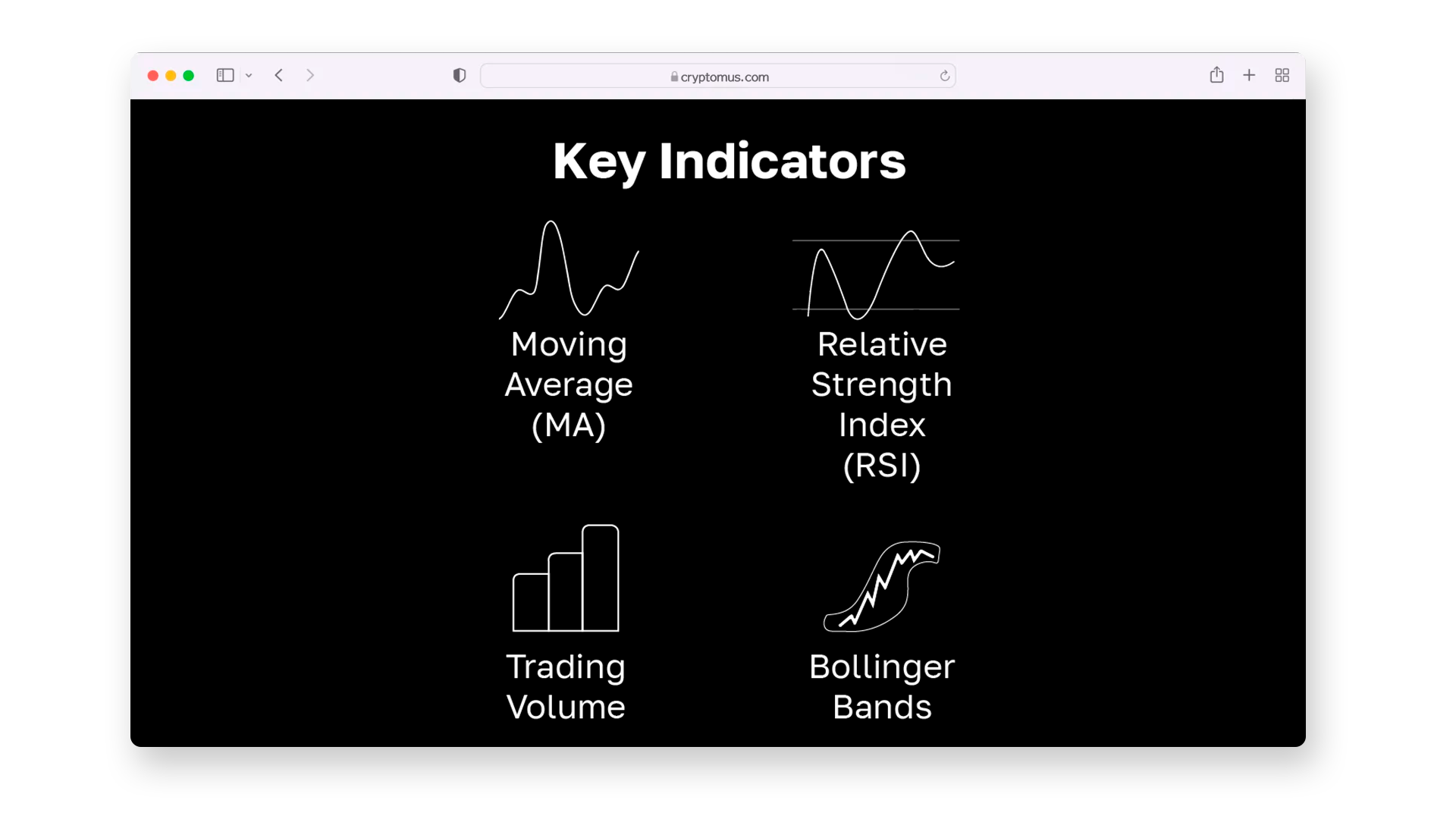
Moving Average (MA)
Moving Averages are used to smooth out price fluctuations and identify the overall direction of a trend.
- Simple Moving Average (SMA) calculates the mid closing price over a specific number of periods.
Example: Imagine Bitcoin's price closed at $30,000, $31,000, $32,000, $31,500, and $33,000 over a five-day period. The simple moving average for this 5-day period would be: (30,000+31,000+32,000+31,500+33,000) divided by 5, which equals $31, 500.
- Exponential Moving Average (EMA) gives more weight to recent prices, making it more responsive to market changes.
Example:
Imagine Bitcoin's price closed at $30,000, $31,000, $32,000, $31,500, and $33,000 over a five-day period.
The exponential moving average for the fifth day, given a previous EMA of $31,000 and k=2/(5+1)=0.333k=2/(5+1)=0.333, would be:
EMA=(33,000⋅0.333)+(31,000⋅0.667)=10,989+20,667=31,656
How it works: If the price is above the moving average, it may indicate a bullish trend. Conversely, if it is below, it suggests a bearish movement.
Relative Strength Index (RSI)
The RSI measures the strength of a trend and indicates whether an asset is overbought or oversold. The RSI ranges between 0 and 100.
For instance, over a 14-day period, crypto X had an average gain of $500 and an average loss of $300.
The RSI is calculated as:
RSI = 100 - (100/(1+RS)), where RS = 500/300 = 1.67, resulting in RSI is 62,5.
- Above 70 indicates overbought conditions, suggesting a potential price drop.
- Below 30 signals oversold conditions, implying a possible price rise.
How it works: RSI is helpful for identifying entry and exit points when the market is either overbought or oversold.
Trading Volume
Trading volume shows how much of an asset was traded within a specific timeframe. It is often displayed as vertical bars below the main chart.
- Rising volume with increasing prices confirms a strong trend.
- Falling volume with rising prices may indicate a weakening trend and a potential reversal.
How it works: High trading volume typically confirms the strength of a price movement, while low volume suggests uncertainty.
Bollinger Bands
Bollinger Bands measure market volatility and can help identify potential price reversals.
- Bands widening indicates increased volatility.
- Bands narrowing suggests reduced volatility and potential breakout.
For example, consider a 20-day period where the SMA is $50, and the standard deviation of prices is $5. The Bollinger Bands are calculated as:
- Upper Band: SMA + (2 * Standard Deviation) = 50 + (2* 5) = 60.
- Lower Band: SMA - (2 * Standard Deviation) = 50 - (2 * 5) = 40.
How it works: If the price touches the upper band, the asset may be overbought; if it hits the lower band, it may be oversold.
Technical Indicators
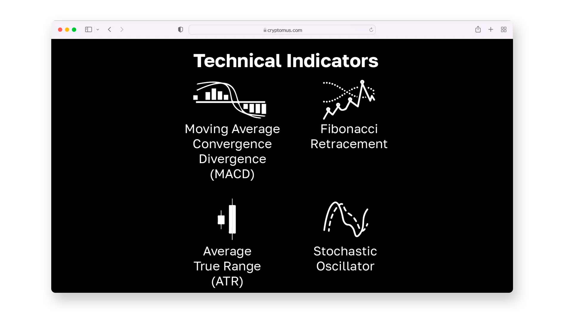
Technical indicators provide traders with deeper insights into market dynamics and assist them in making informed decisions. Here are some advanced tools frequently used in reading cryptocurrency trading charts.
Moving Average Convergence Divergence (MACD)
The MACD helps identify changes in trend strength, direction, and momentum.
- Consists of two lines: the MACD line (the difference between two moving averages) and the signal line.
- Crossover signals: If the MACD crosses above the signal line, it’s a signal to buy; if it crosses below, it’s a signal to sell.
How to use it: Useful for spotting trend reversals and confirming existing trends.
Fibonacci Retracement
This tool is used to identify potential support and resistance levels based on the Fibonacci sequence.
Key retracement levels: 23.6%, 38.2%, 50%, 61.8%, and 78.6%.
How to use it: Useful for predicting potential pullback levels where price might reverse during a trend.
Stochastic Oscillator
This indicator compares the current price of a crypto to its price range over a set period, helping to determine overbought or oversold conditions.
- Above 80: Overbought, indicating a possible downward reversal.
- Below 20: Oversold, signaling a potential upward movement.
How it works: The Stochastic Oscillator is particularly effective when used with other indicators to confirm market entry or exit points.
Average True Range (ATR)
ATR measures market volatility by showing the average range of price movement over a given period.
- High ATR indicates strong volatility, with potential for significant price swings.
- Low ATR suggests a calm market with less price fluctuation.
How to use it: Often used to set stop-loss levels and manage risk in volatile markets.
Chart Patterns
Chart patterns are formations created by the movement of an asset's price on a chart over time. These patterns are used by traders to forecast future price movements, identify potential reversals, or confirm the duration of trends. Understanding these patterns is essential for anyone looking to engage in cryptocurrency trading, as they provide critical insights into market psychology and price dynamics.
Head and Shoulders
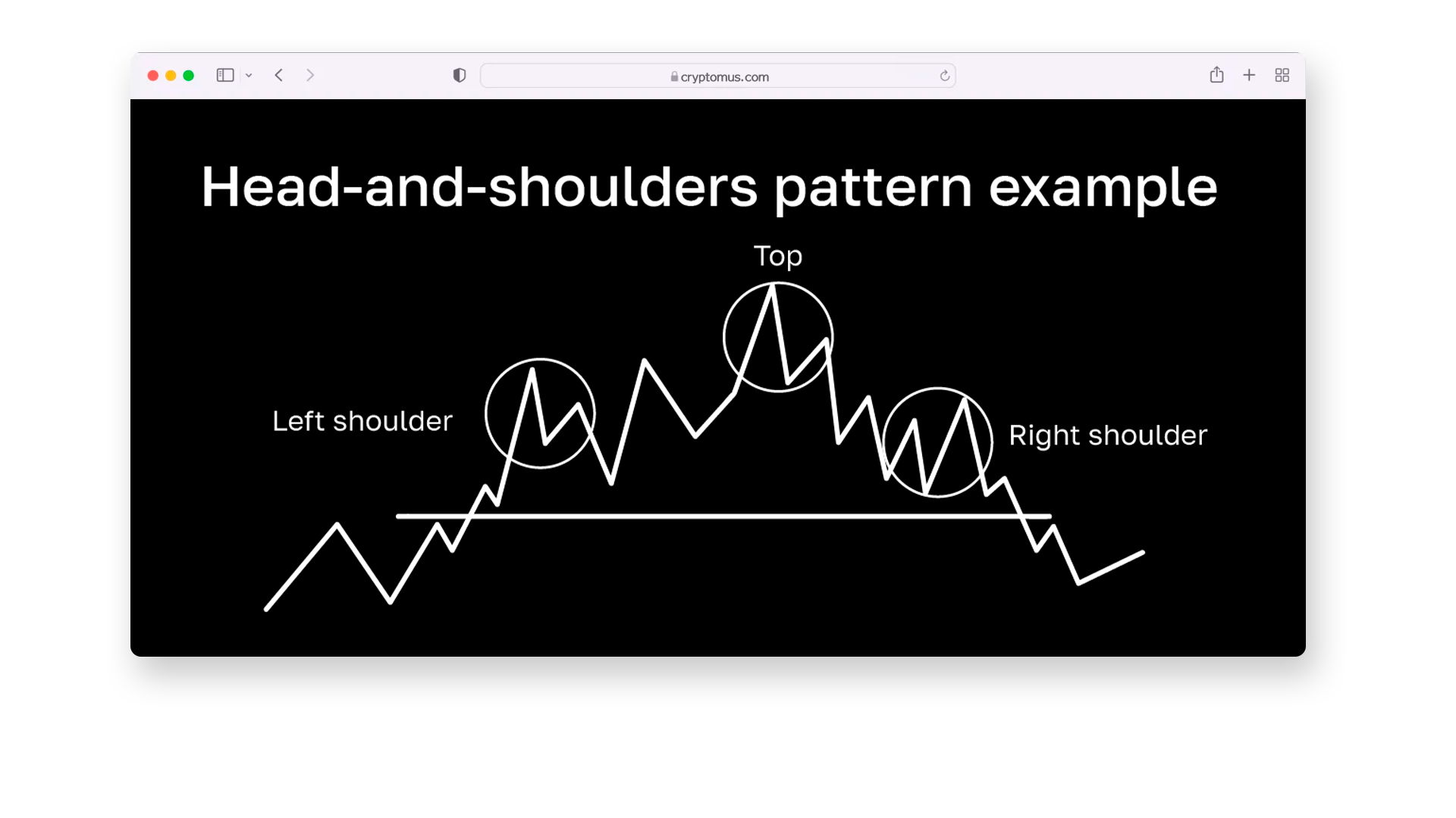
The Head and Shoulders pattern signals a potential trend reversal, usually from bullish to bearish. It consists of three peaks:
- Left Shoulder: A rise in price followed by a decline.
- Head: A higher peak than the left shoulder, followed by another decline.
- Right Shoulder: A peak that is lower than the head but similar in height to the left shoulder, followed by another decline.
How to use it: When the price breaks below the "neckline" (the line drawn across the lows of the two dips), it indicates a bearish reversal, and traders may look for sell opportunities.
Double Top
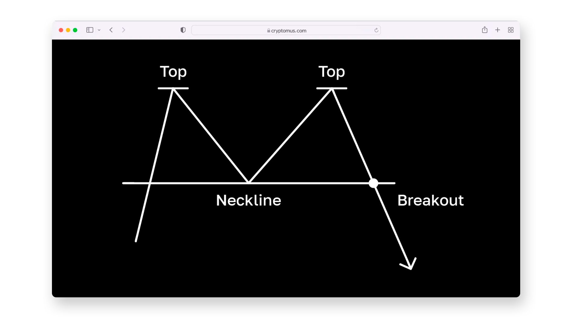
The Double Top pattern suggests that an uptrend is weakening and may reverse. It consists of two peaks at approximately the same level, indicating resistance. The first peak is followed by a decline, and then the price rises again to form a second peak near the first one.
How to use it: When the price breaks below the valley between the two peaks, it confirms the bearish trend reversal, and traders may look for sell opportunities.
Double Bottom
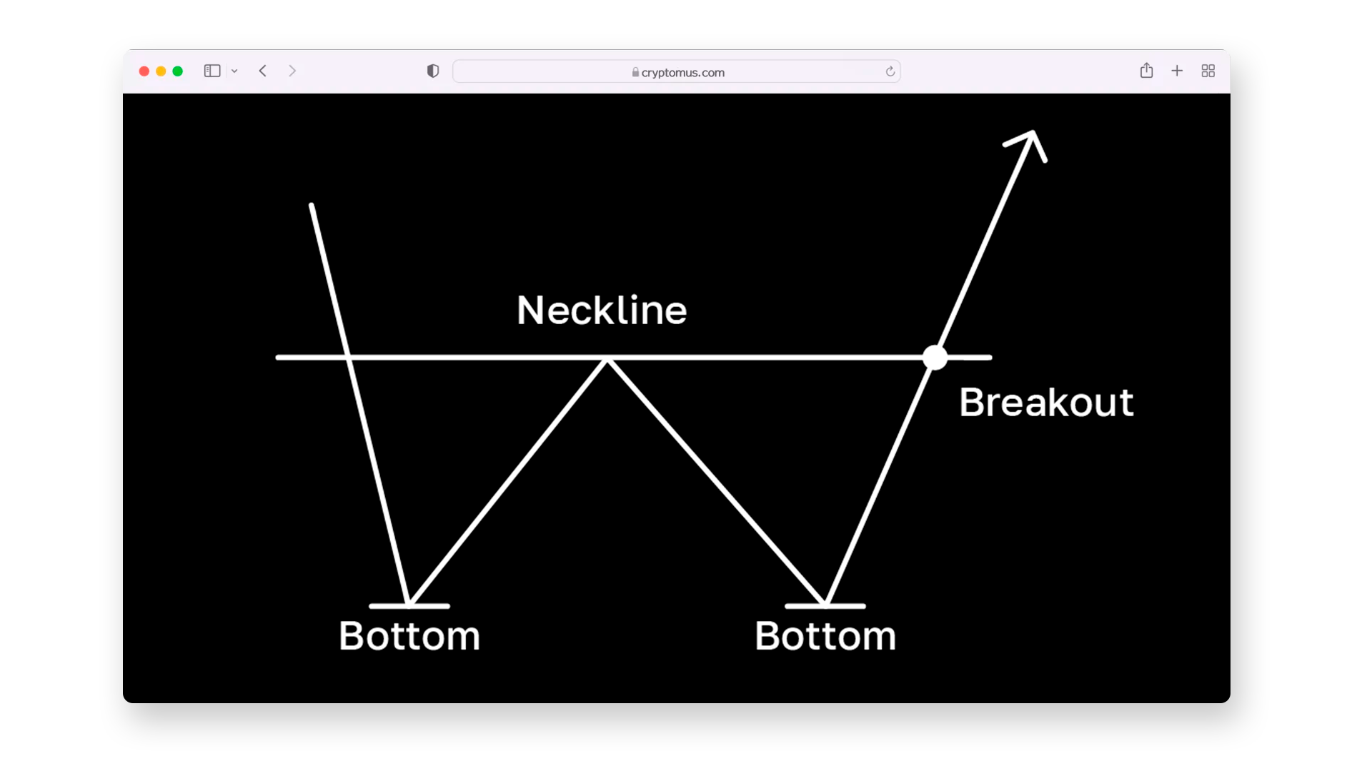
The Double Bottom pattern indicates a potential bullish reversal, marking the end of a downtrend. It consists of:
- A decline in price, followed by a brief rise.
- A second decline to nearly the same level as the first, followed by another rise.
How to use it: When the price breaks above the resistance level formed by the peaks between the bottoms, it signals a bullish reversal, and traders may look for buy signals.
Triangles
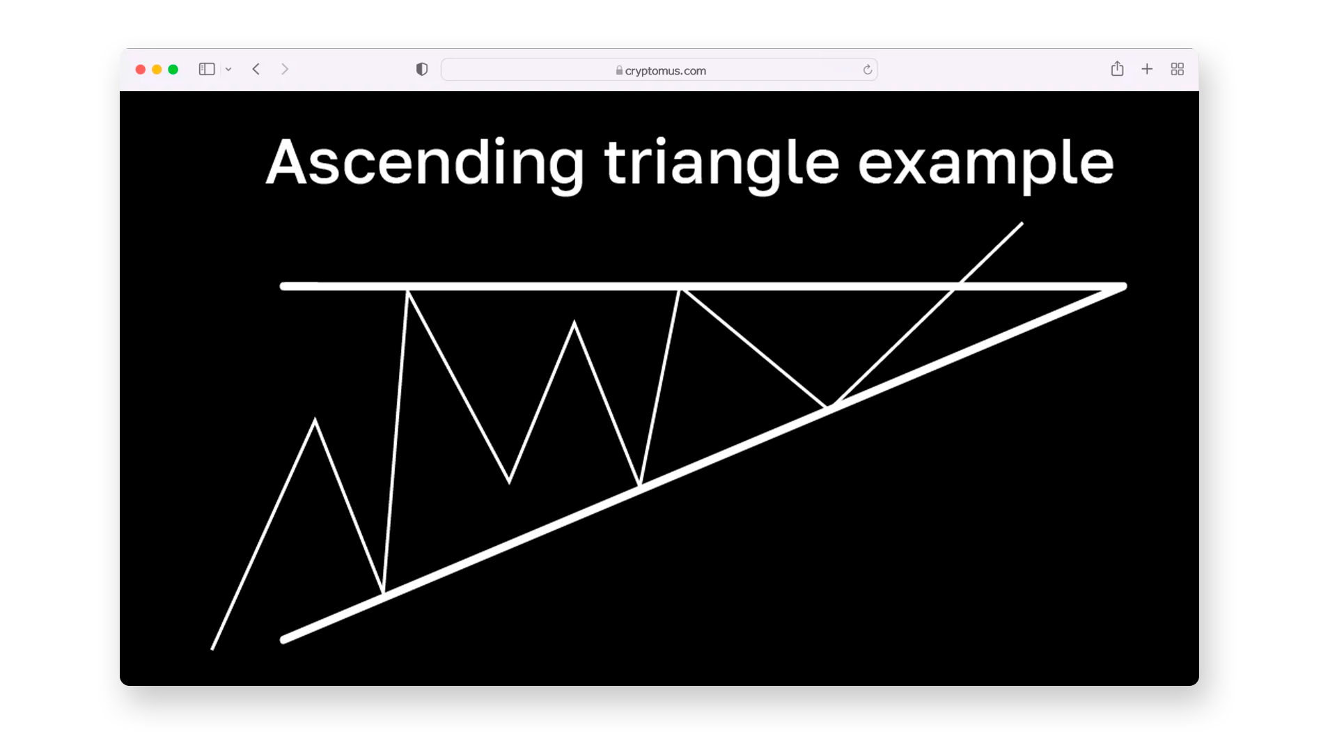
Triangles are continuation patterns that indicate a pause in the current trend before the price resumes in the same direction. There are three main types:
- Ascending Triangle: A flat upper resistance level and rising lower support level. It indicates that buyers are pushing the price higher, and a breakout to the upside is likely.
- Descending Triangle: A flat lower support level and descending upper resistance. It indicates that sellers are dominating, and a breakout to the downside is likely.
- Symmetrical Triangle: Both support and resistance are converging, signaling indecision in the market. A breakout could occur in either direction, and traders often wait for it to determine the next move.
How to use it: Traders often look for a breakout from the triangle pattern, with the breakout direction confirming the continuation of the previous trend.
Flags and Pennants
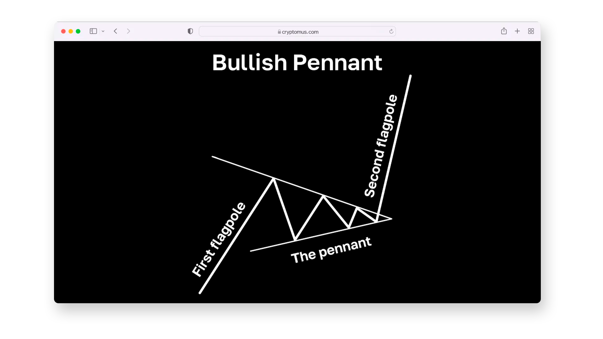
Flags and pennants are short-term continuation patterns that indicate consolidation before the trend resumes.
- Flag: A rectangular-shaped consolidation pattern that slopes against the prevailing trend.
- Pennant: A small symmetrical triangle that forms after a strong price movement.
How to use it: Both patterns signal that a strong trend is likely to continue once the price breaks out in the direction of the previous move.
How To Read Crypto Charts For Successful Trading?
To trade cryptocurrency successfully, it's essential to understand how to read charts and interpret the data they show. Charts offer insights into current market trends, potential entry and exit points, and can help predict future price movements. Let's break down the key steps that will help you analyze cryptocurrency charts effectively and make informed trading decisions, according to them.
- Identify the Market Trend. Determine whether the market is in an uptrend, downtrend, or moving sideways. This helps align your trades with the overall market direction.
- Spot Key Support and Resistance Levels. Look for the price points where the market has reversed in the past. Support levels act as floors, and resistance levels act as ceilings. These indicators will help you determine entry and exit points.
- Recognize Chart Patterns. Identify common patterns such as Head and Shoulders, Double Tops, and Triangles. They may indicate potential trend reversals or continuations.
- Use Technical Indicators. Apply indicators like Moving Averages, RSI, MACD, or Bollinger Bands to confirm market trends and potential entry/exit points. They give additional insights into market momentum and strength.
- Choose the Right Timeframe. Select a timeframe that matches your trading style—short-term for scalping or day trading, medium-term for swing trading, or long-term for position trading.
- Set Stop-Loss and Take-Profit Orders. Protect your trades by setting stop-loss and take-profit levels based on key support and resistance areas. This helps you manage risk and lock in profits.
- Monitor and Adjust. Continuously monitor the chart and adjust your strategy if market conditions change. Flexibility is crucial for adapting to the volatile crypto market.
Reading cryptocurrency charts isn’t about predicting the future — it’s about understanding probabilities and market behavior. With a good grasp of chart types, indicators, and patterns, you can make more informed decisions instead of relying on intuition.
With practice, you’ll start recognizing trends faster, spotting better entry and exit points, and adjusting your strategy to changing conditions. Begin with one chart type, one timeframe, and a couple of indicators — then build your skills gradually.
Mastering chart reading takes time, but it’s one of the most valuable abilities for navigating the crypto market with confidence.
Simplify Your Crypto Journey
Want to store, send, accept, stake, or trade cryptocurrencies? With Cryptomus it's all possible — sign up and manage your cryptocurrency funds with our handy tools.
Get Started
